3 Poster Series: Elusive Echoes
This experimental poster design project focused on developing a set of three posters with coherence between them, while also having the ability to stand on their own.
Free Play Studio
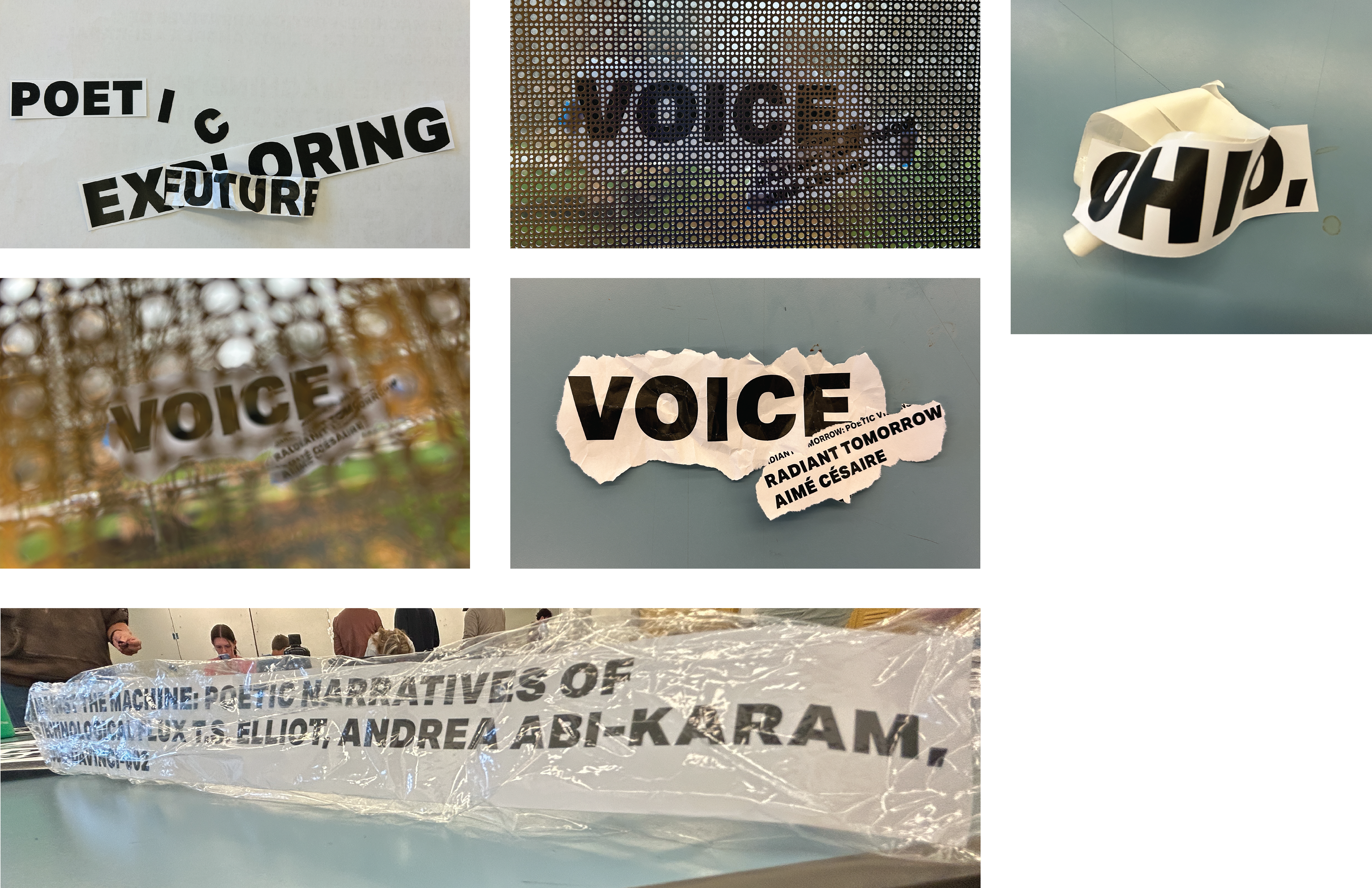
I took time in studio experimenting with different materials and different textures to see the many ways type could be manipulated.
Sketching
After going through a hands on process, I then moved onto sketching out ideas which could be used.
Round 2
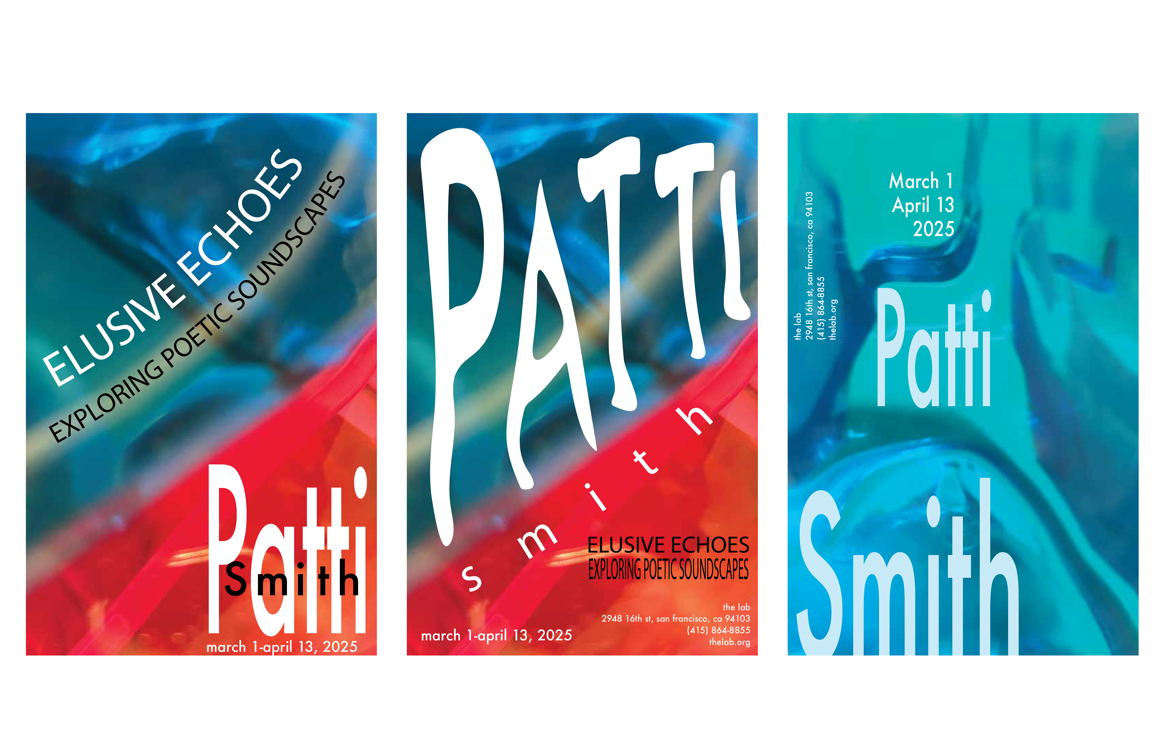
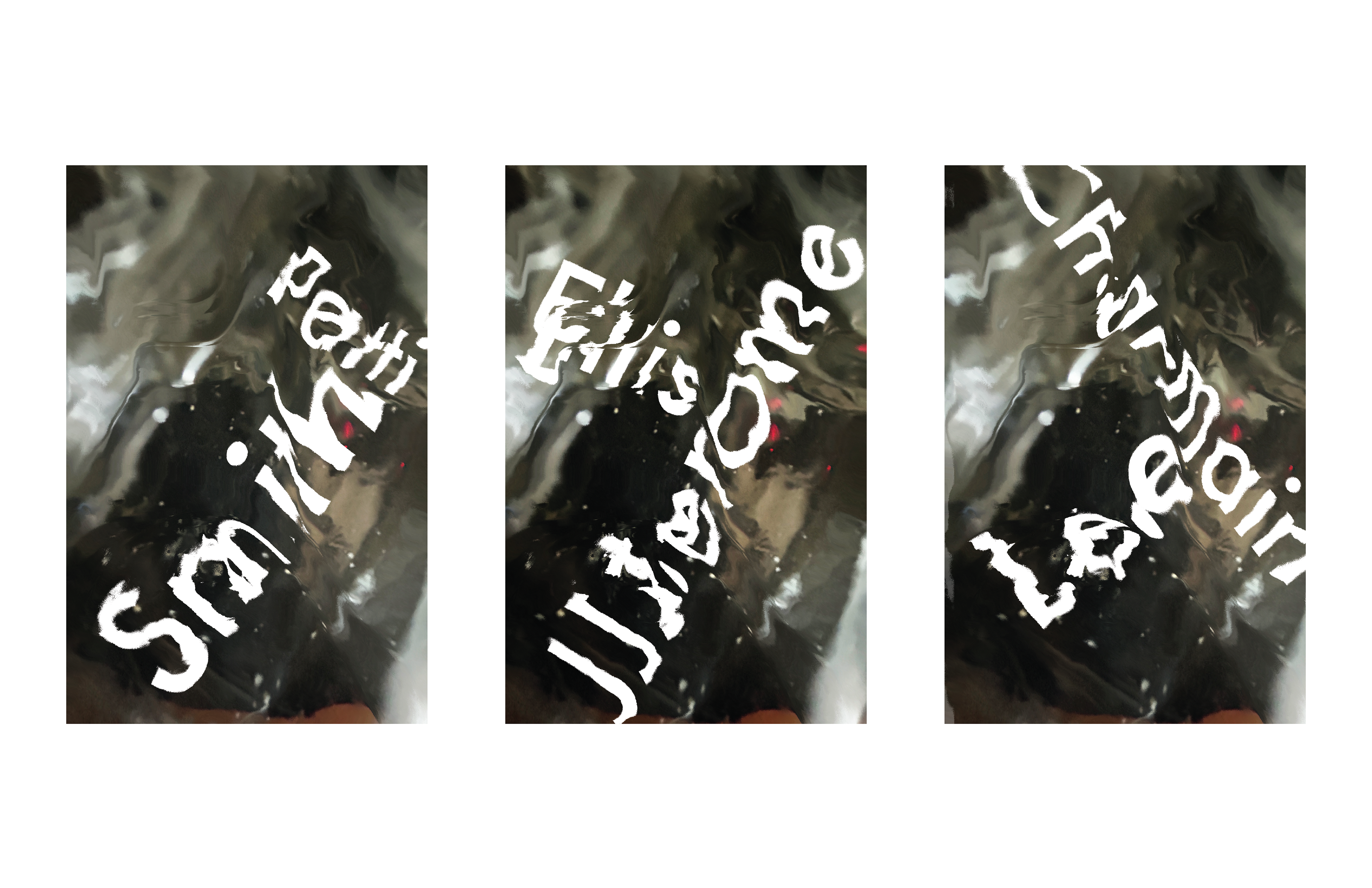
After some sketches to see what I thought worked effectively, I noticed sketch three had a visually appealing background while the other two were too busy. I was still not satisfied with the typography however, but decided to continue working on the background. A black and white color scheme using my mouthwash bottle and the displacement tool within photoshop seemed the most effective. I integrated the artist name into the background as well to bring attention to it.
Round 3
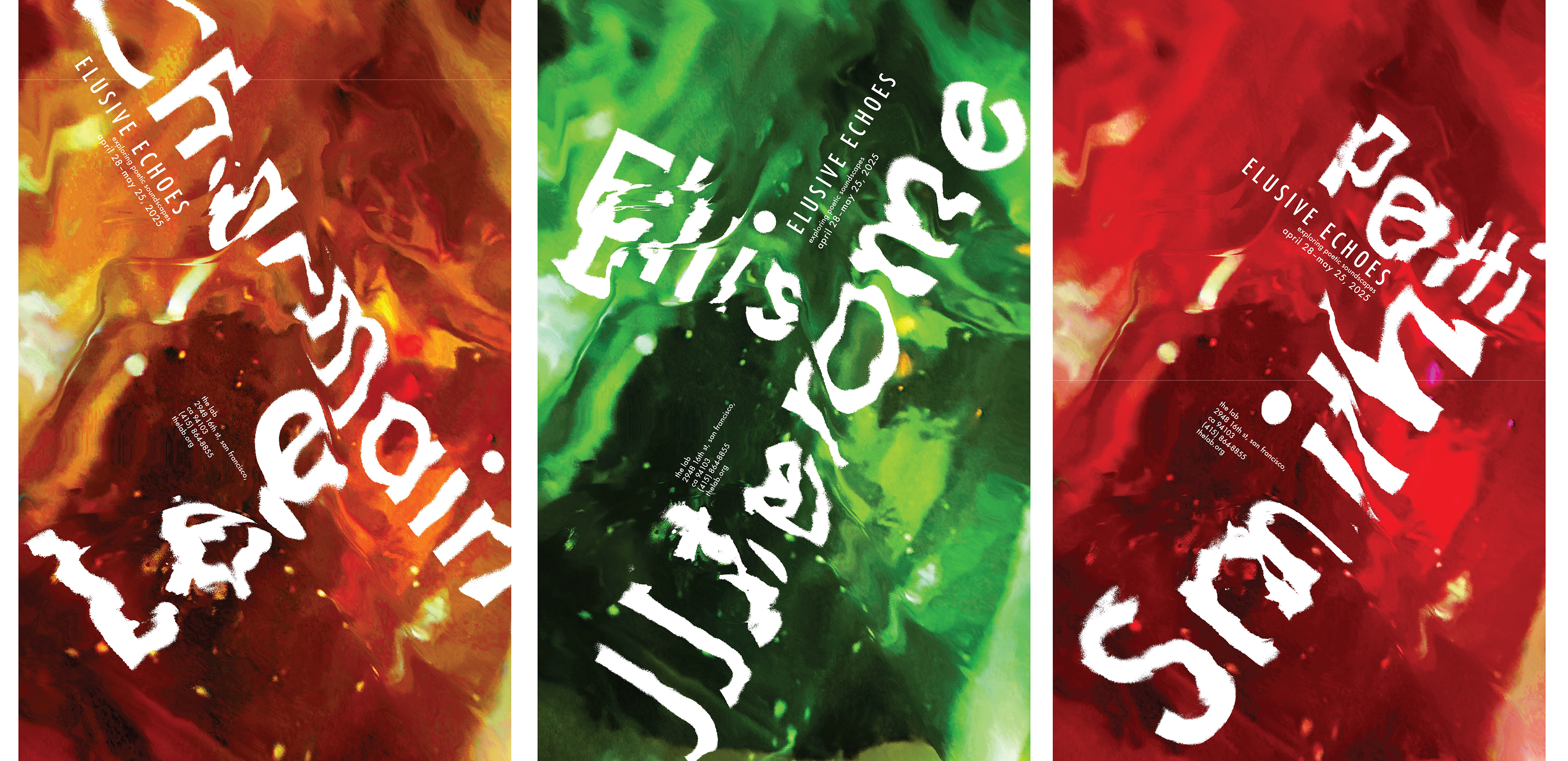
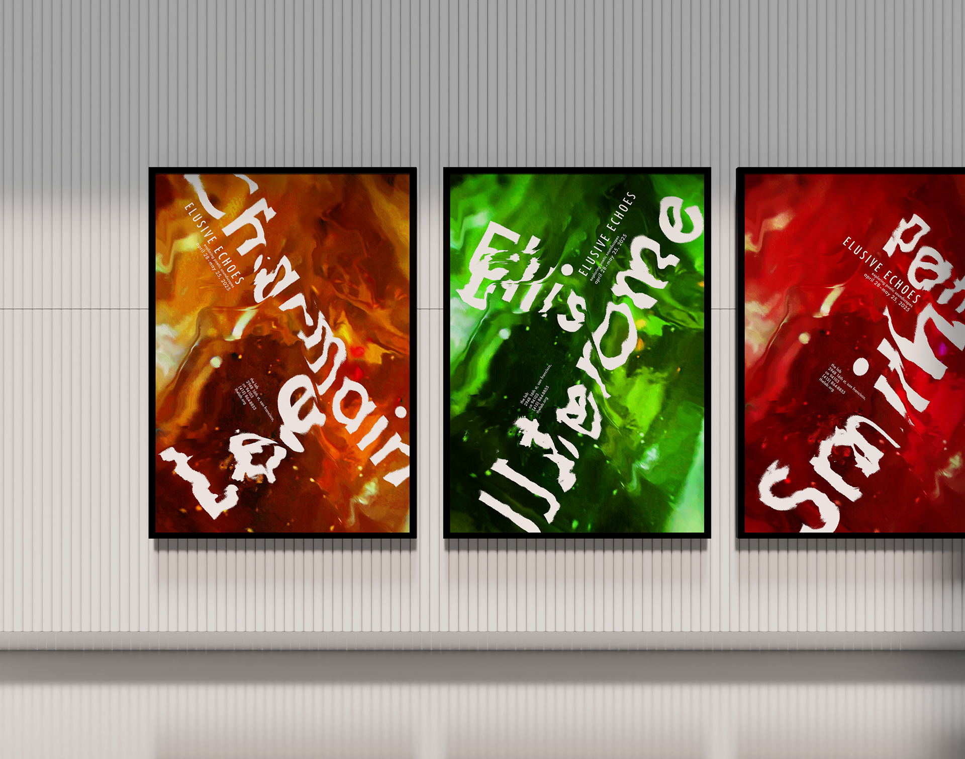
The next step was exploring with the complementary type, since this background worked well. I did four studies and realized the secondary type did not stand out against black and white so I decided to color the background based off of the artists and their personalities. Charmaine got orange because it represents her uniqueness and creativity in her music making strange noises along with the joy she aims to spread with her music, all of which are common associations with the color orange.
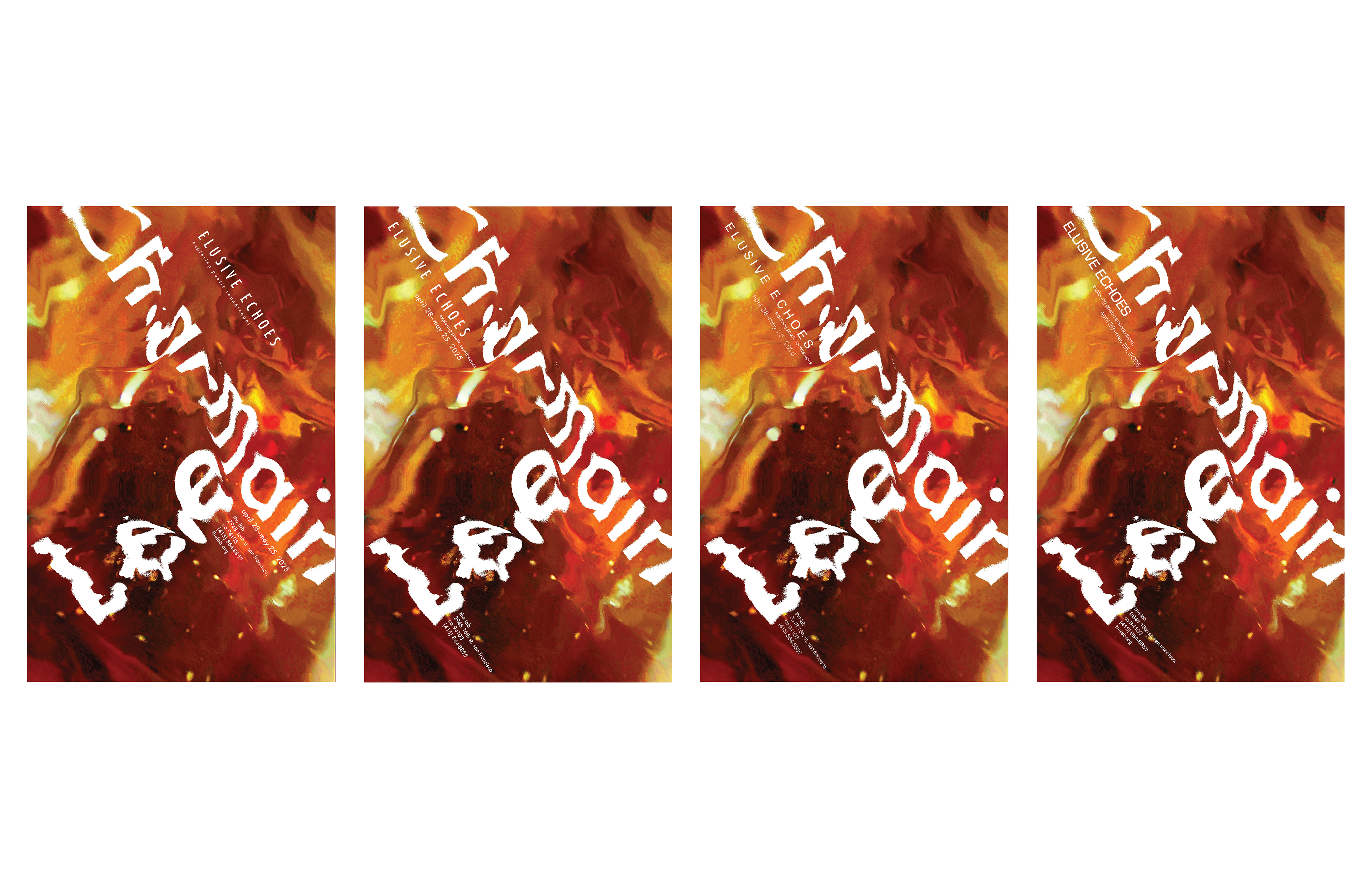
Final Posters
All three of them got distinct colors, Charmaine for her uniqueness and creativity, Jerome for his calmness and connection to nature, and Patti for her boldness. The type on each one was grouped similarly but placed differently to give them each a distinct look while also connecting to each other as a series.