Cadence Magazine
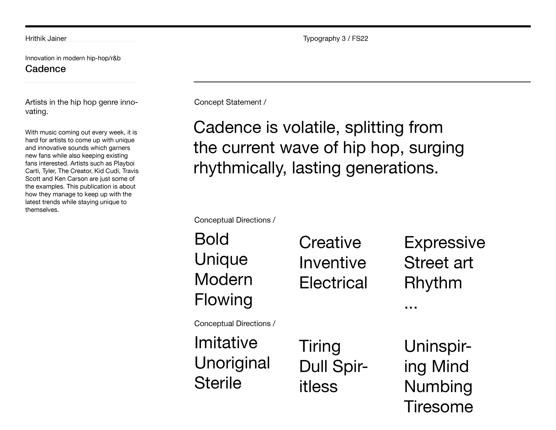
This project consisted of creating a word mark along with a magazine which fit my concept statement.
Wordmark Ideation
I began the project working on the Cadence wordmark. At first I was coming up with ideas based solely off of my concept statement, however after a few rounds of iteration not being as successful as I liked, I stepped back and researched hip hop word marks, and found inspiration in artists such as Lil Wayne, DMX, and Jay Z.
Final Wordmark
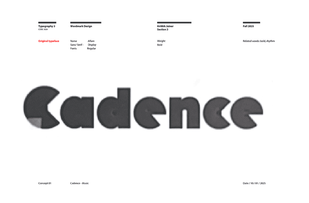
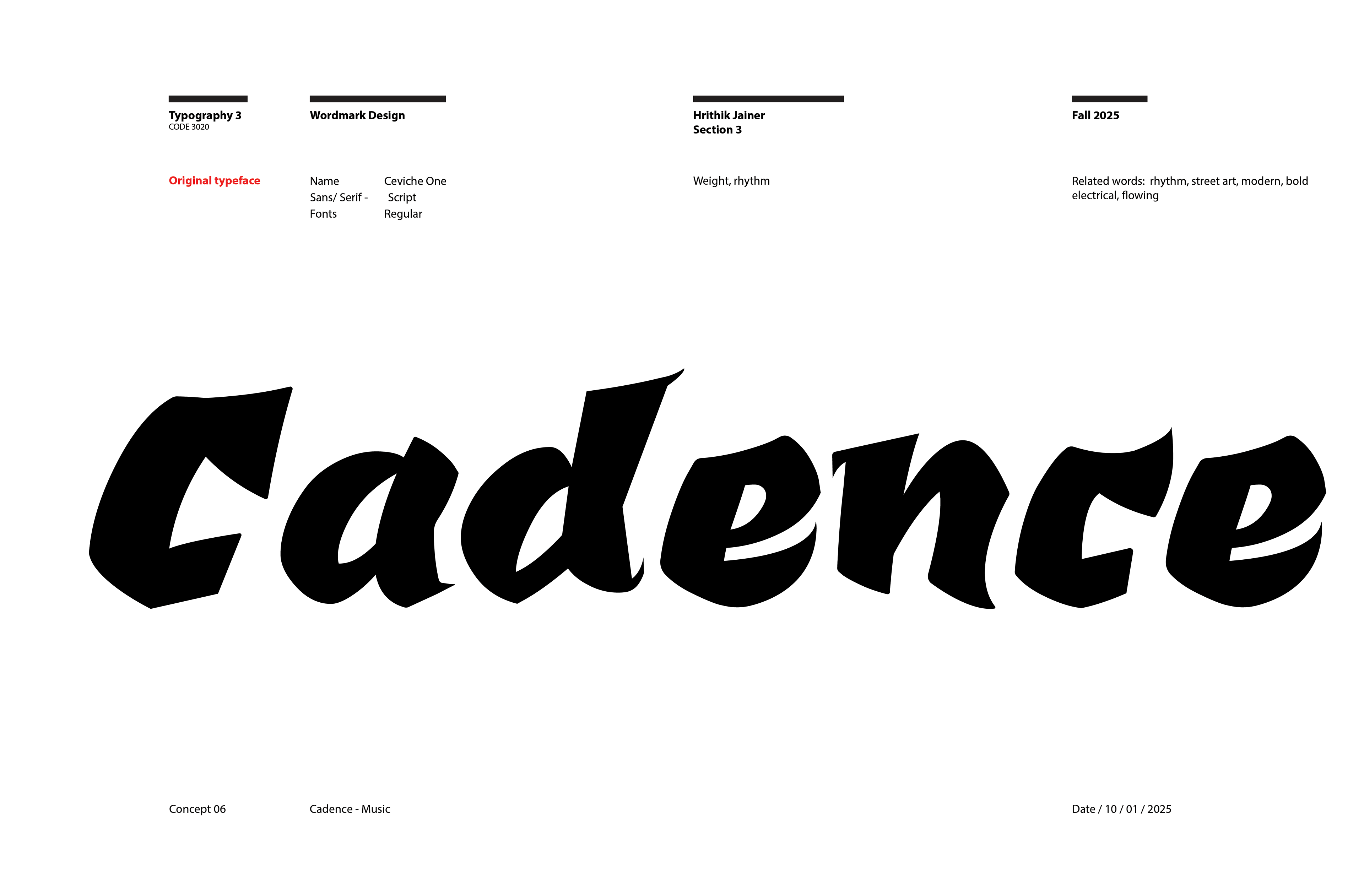
I settled on a script typeface, Ceviche One, since it was very expressive and bold, and made slight alterations to it. Since my concept statement referred to timelessness and the past, I incorporated my previously mentioned callbacks such as DMX, along with newer hip hop typography such as Playboi Carti in small details such as the exaggerated serifs.
Original
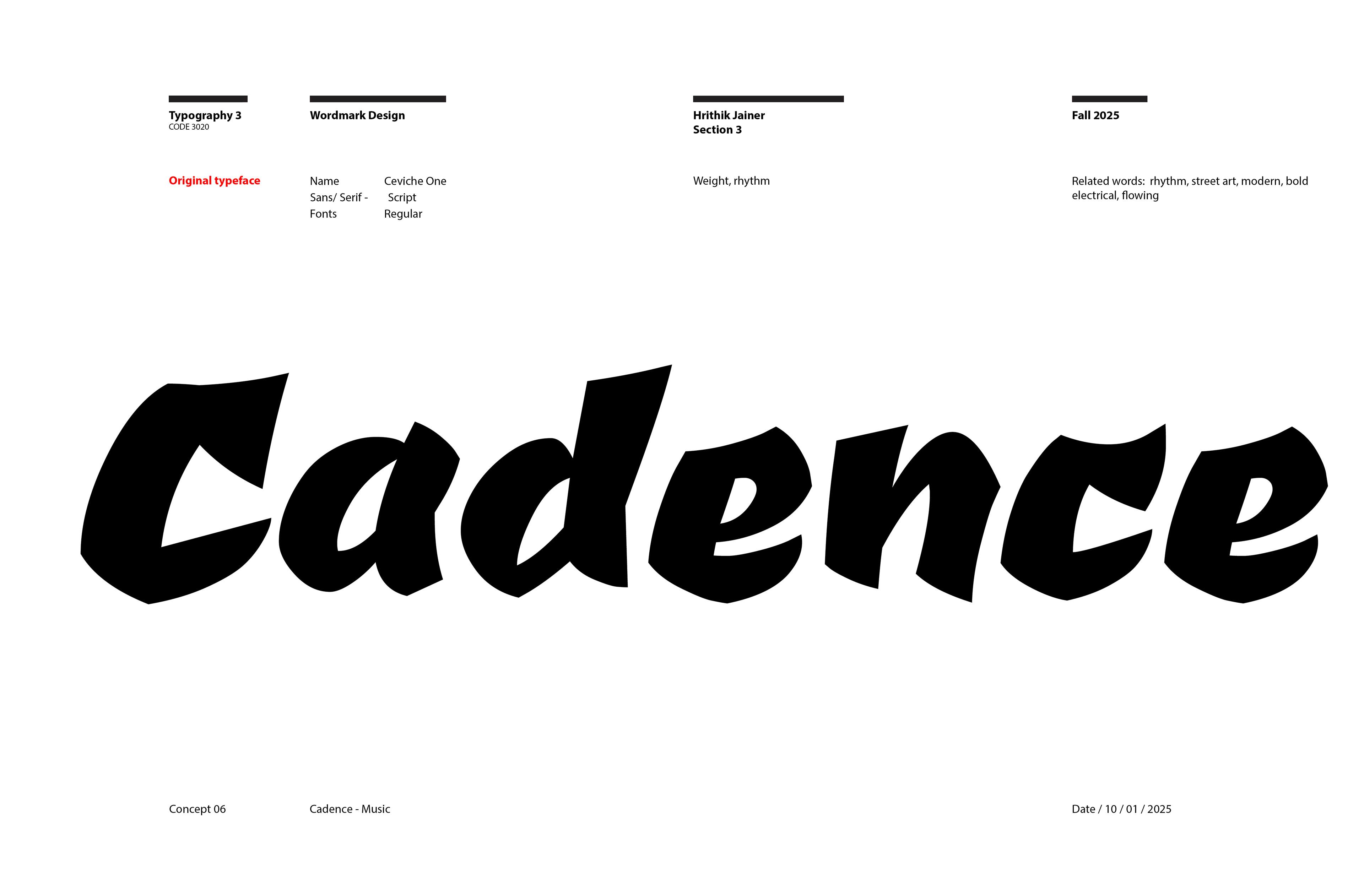
Wordmark
Magazine Iterations
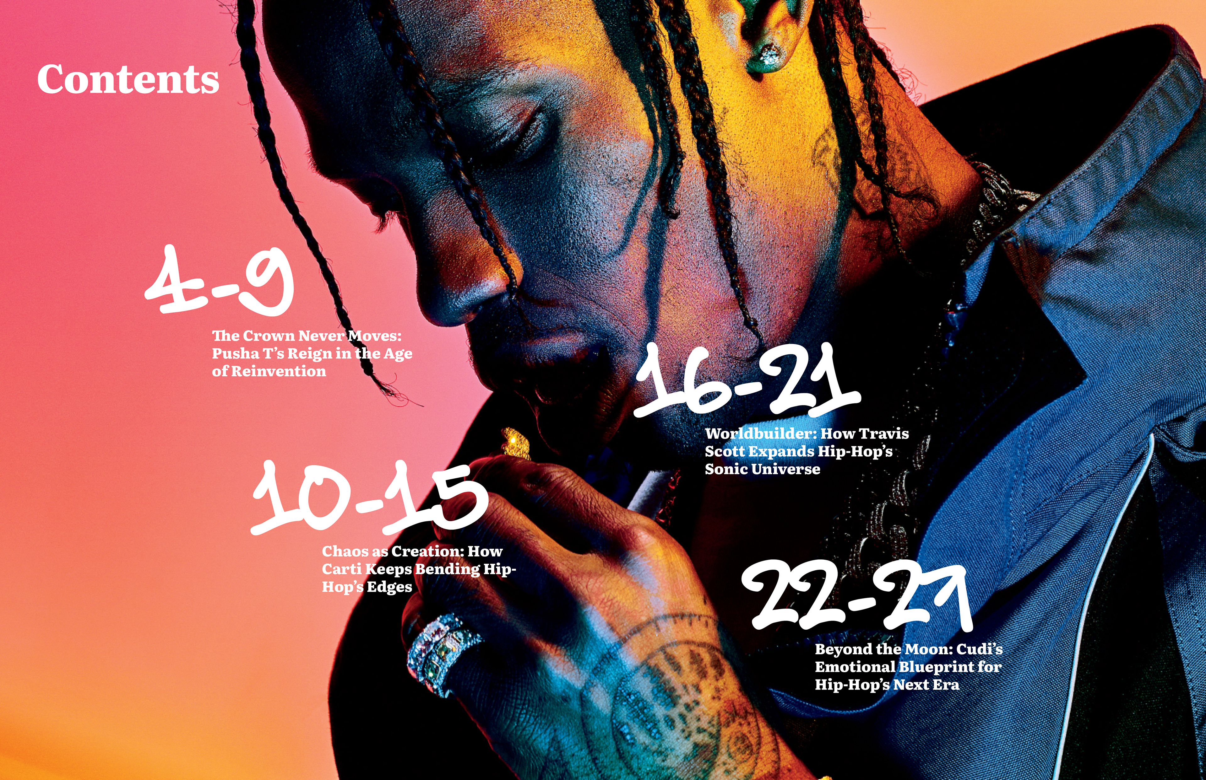
Throughout my magazine I wanted to maintain the same bold, expressive feel of my wordmark, so through iteration I worked through many local and global rules to incorporate my concept statement into the magazine.
Final Magazine
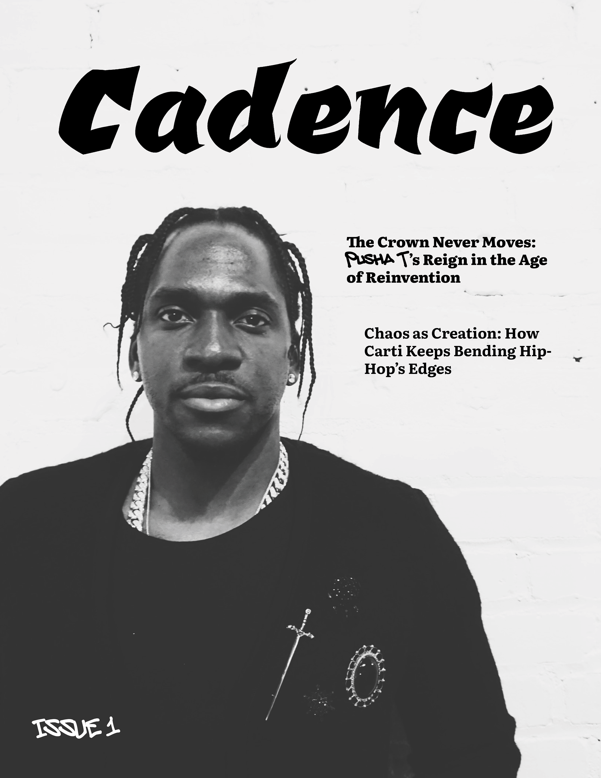
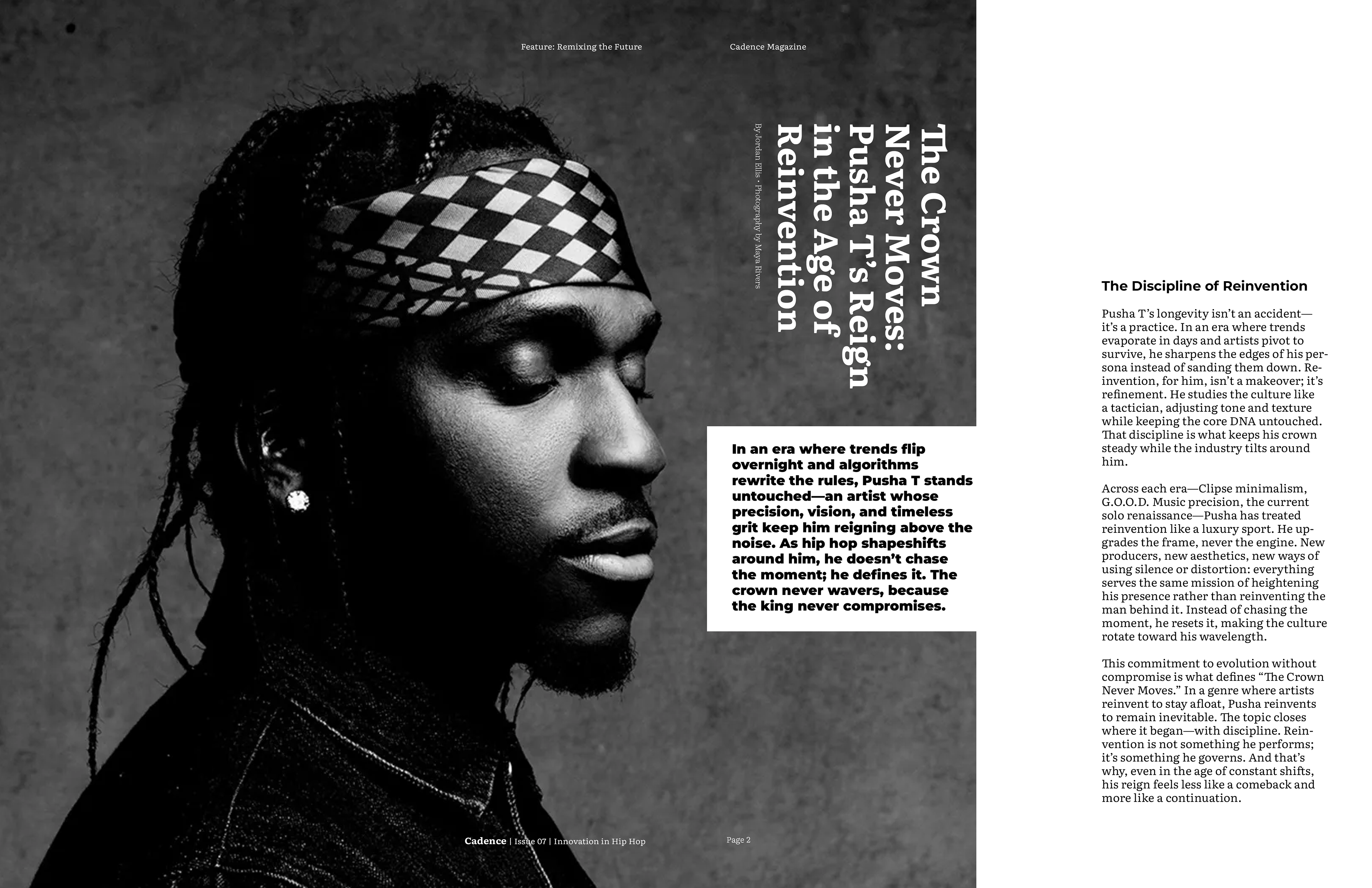
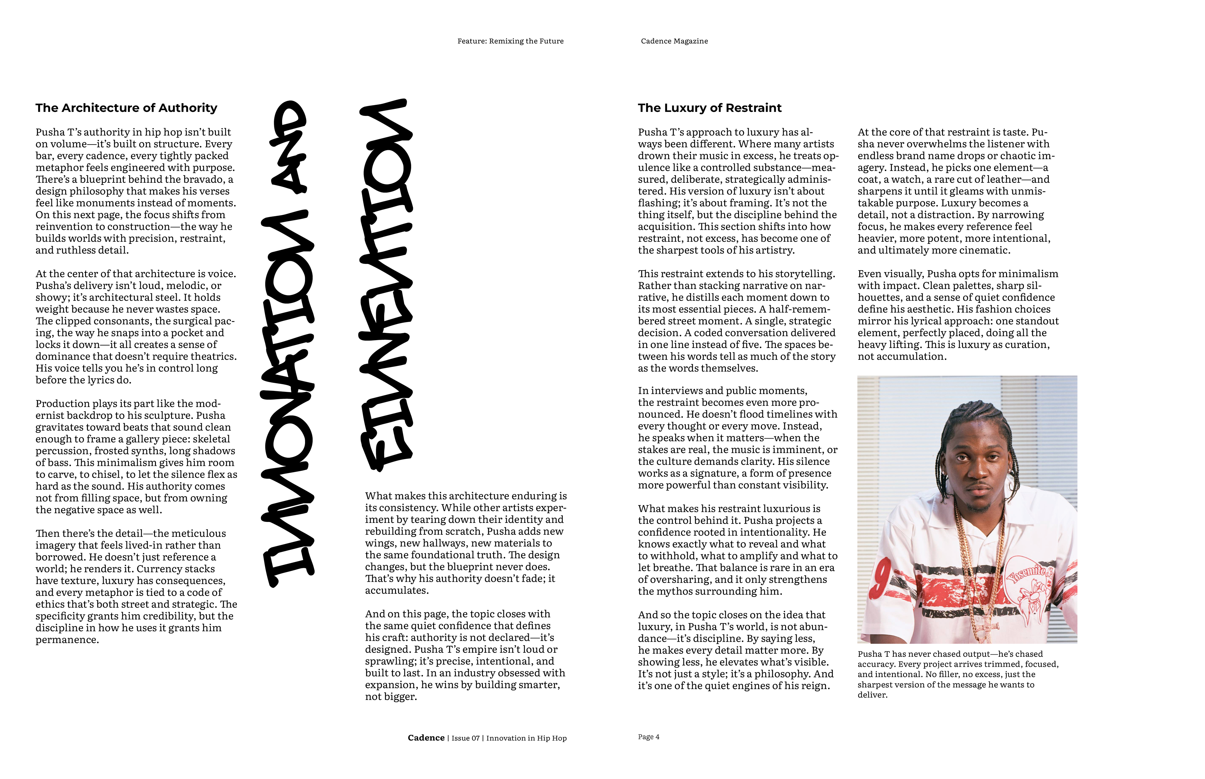
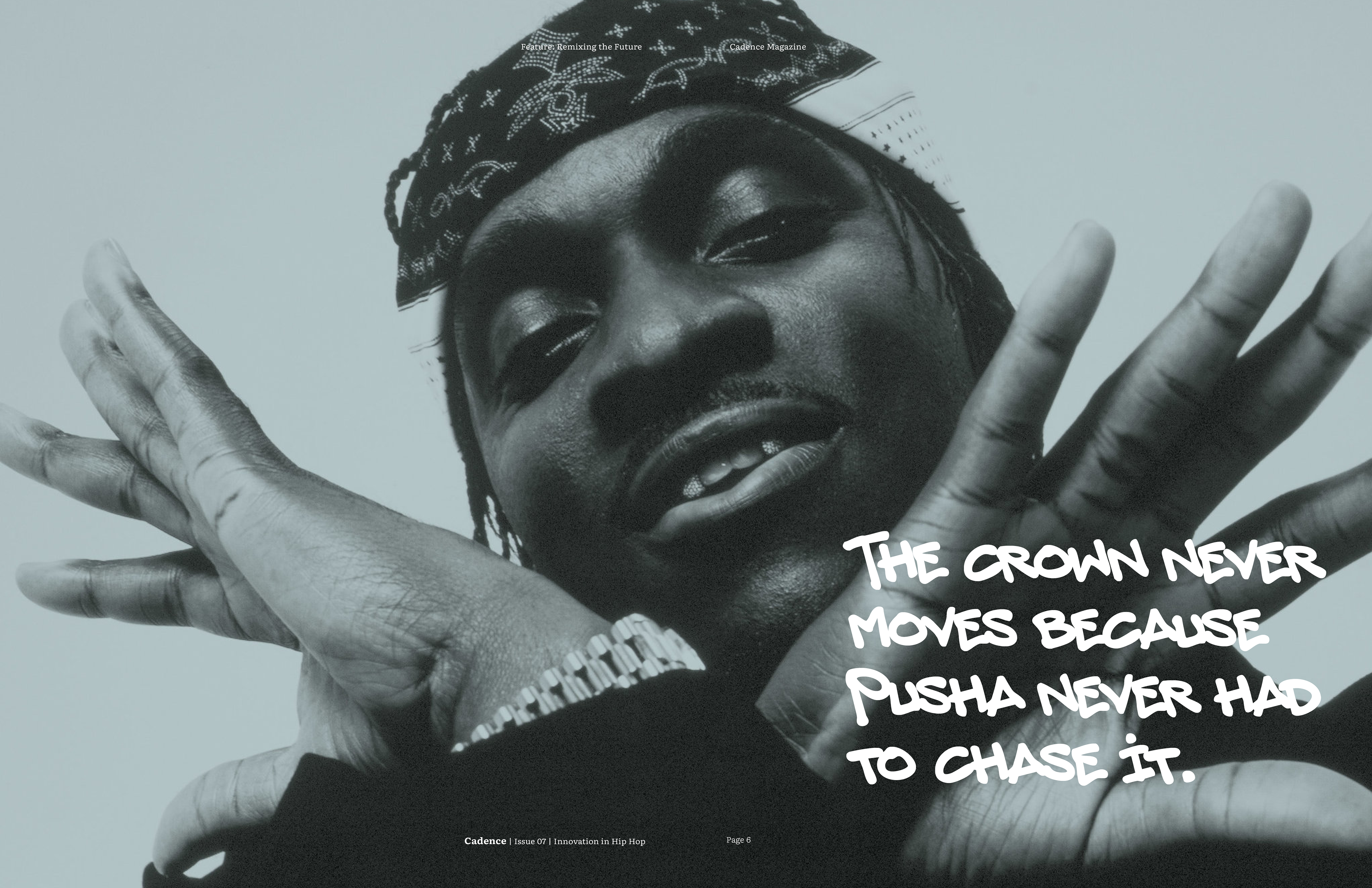
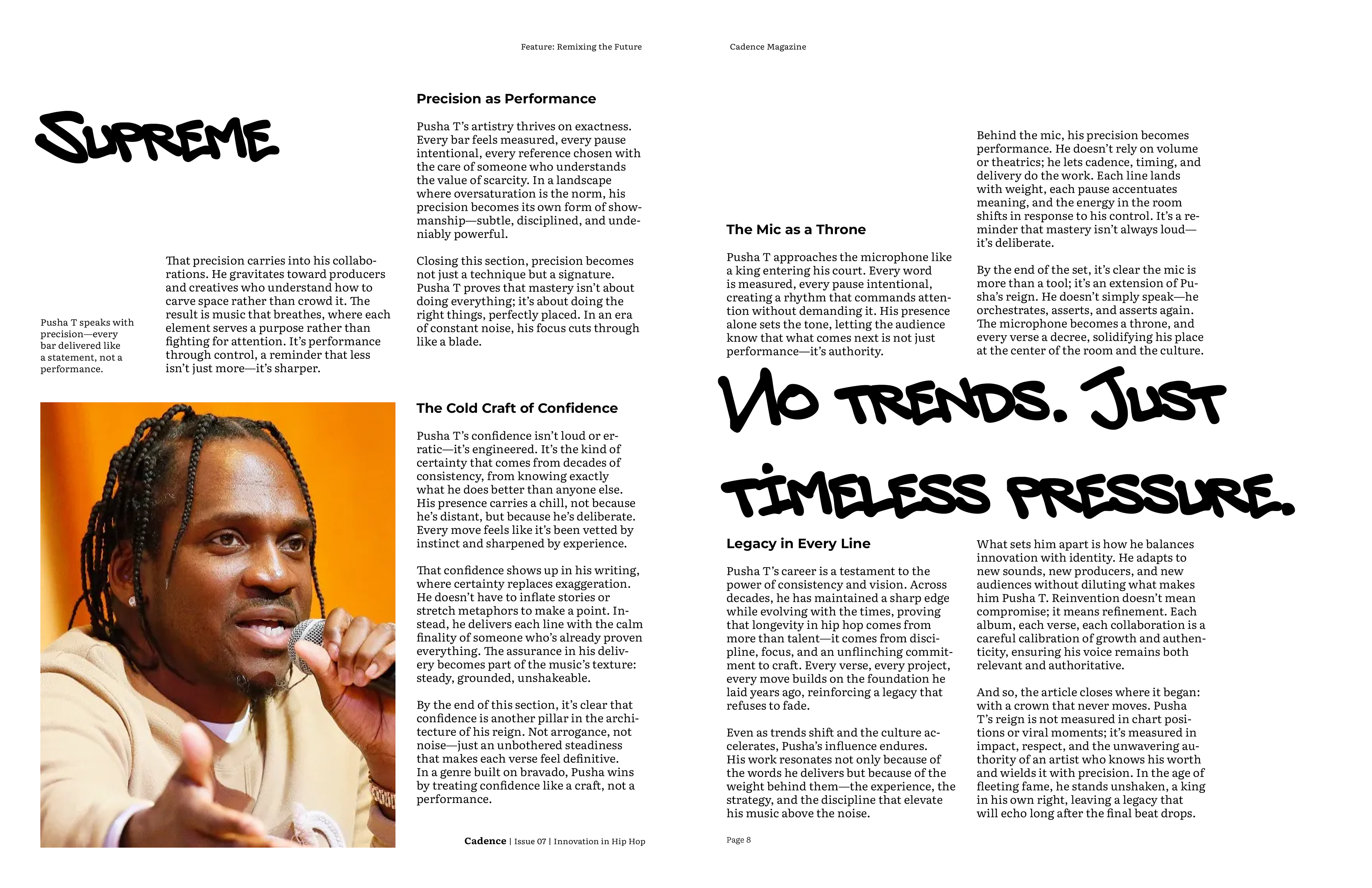
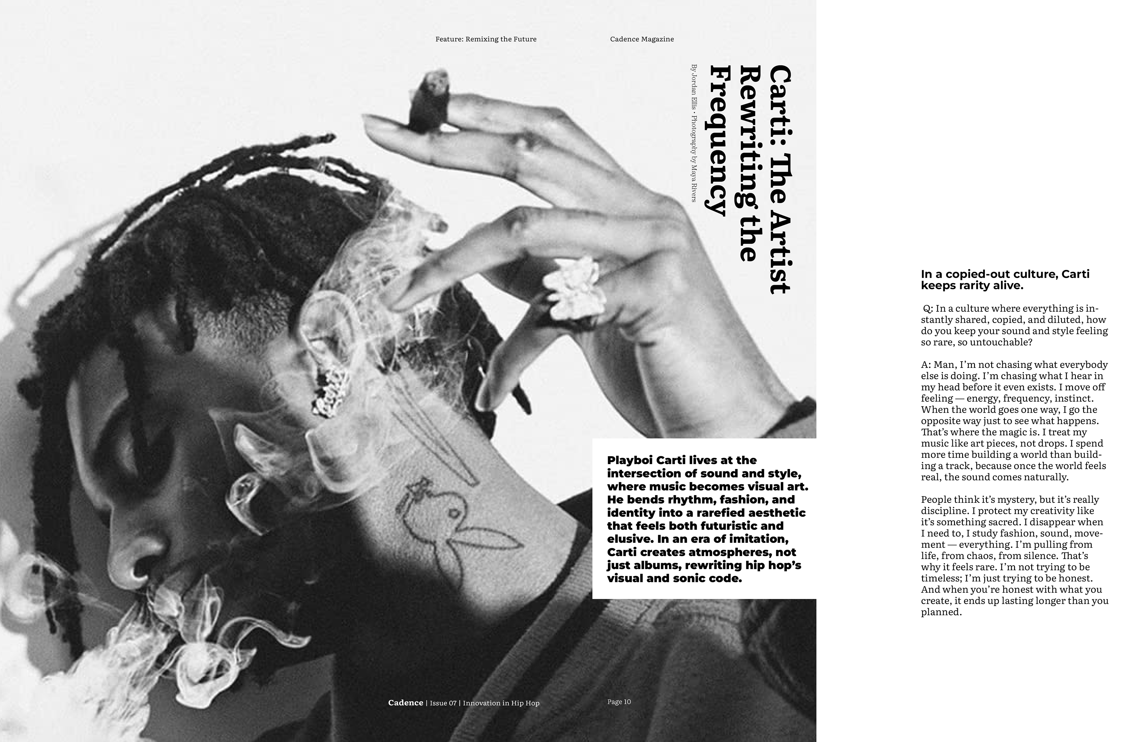
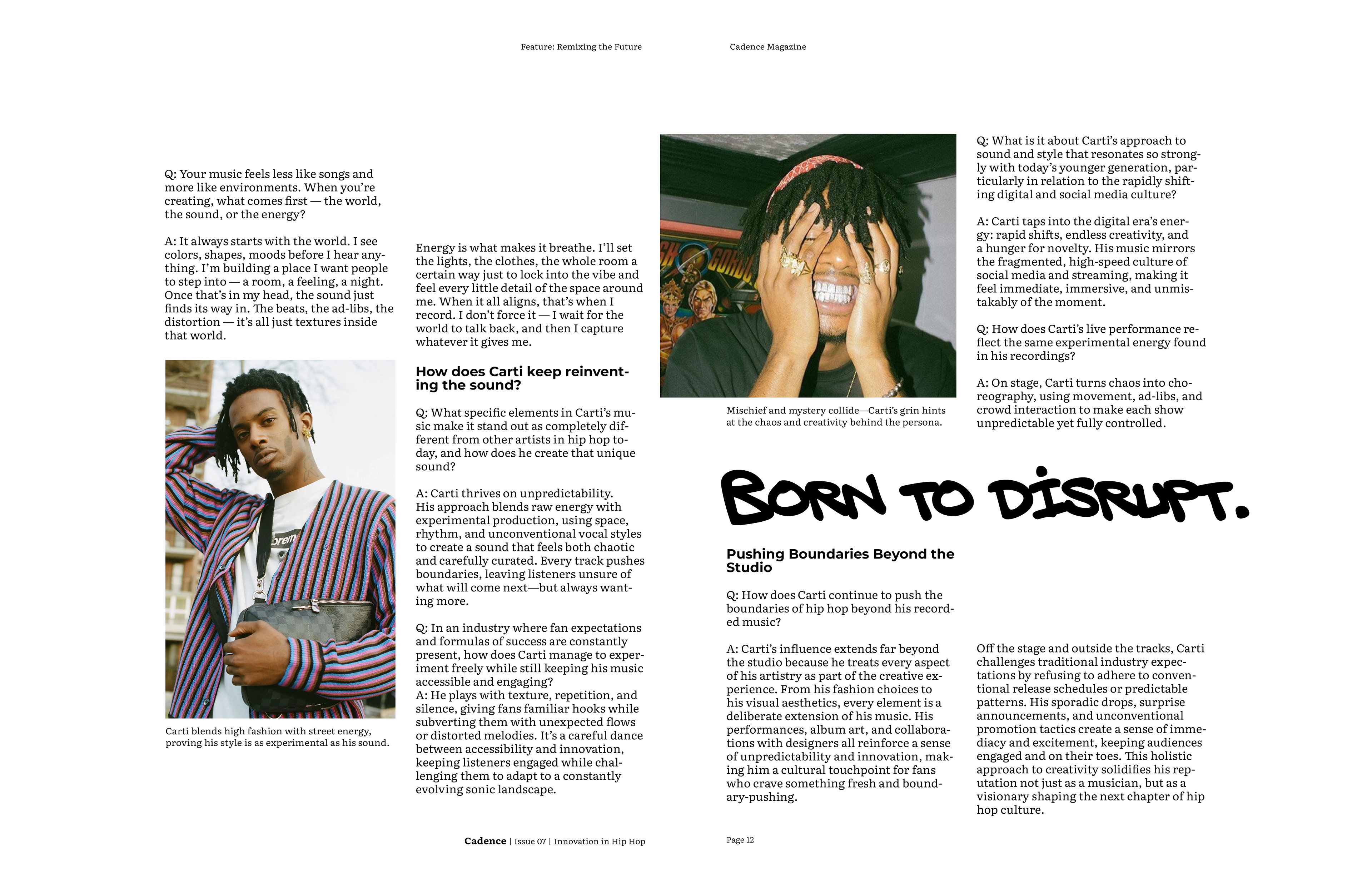
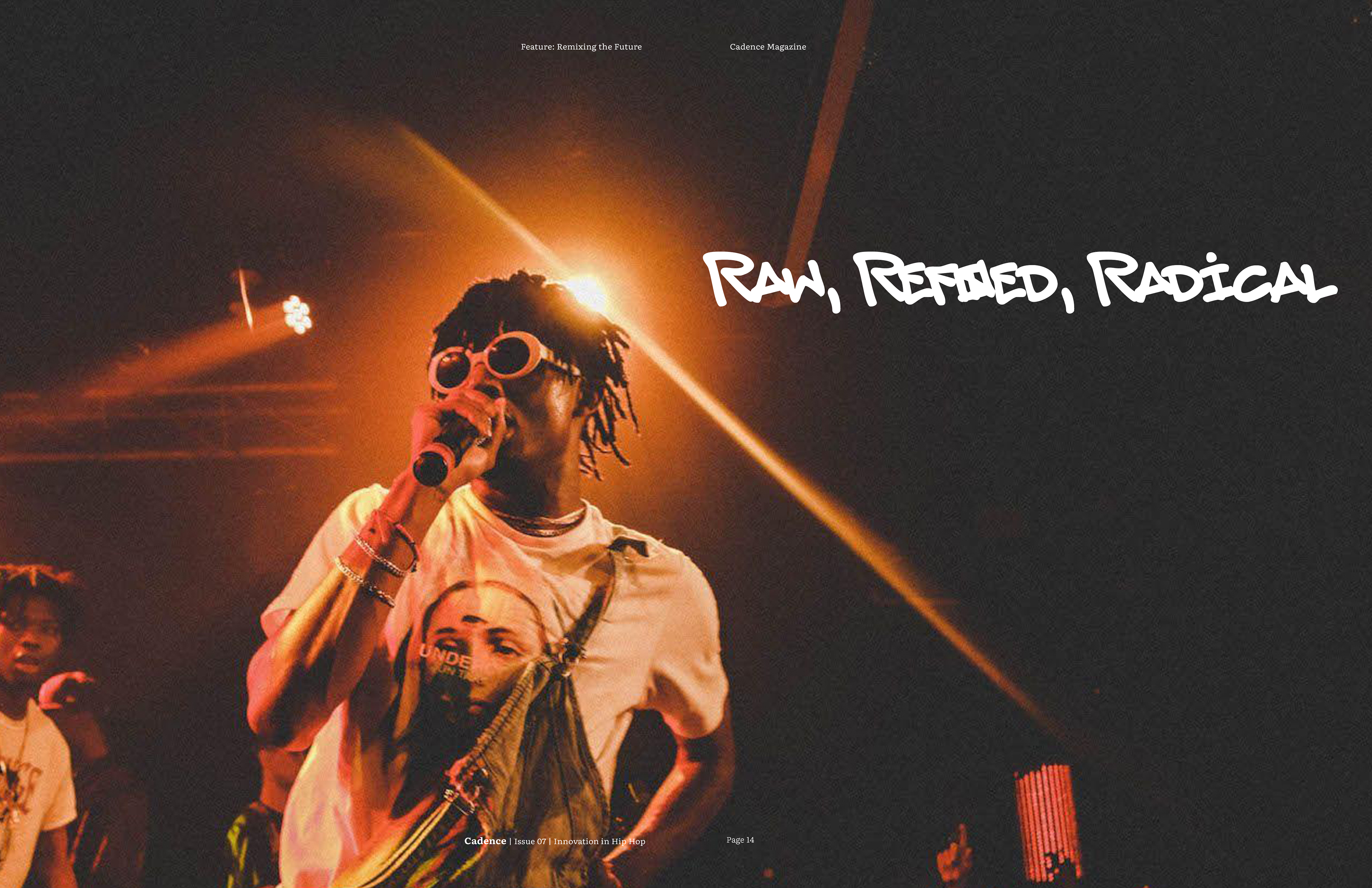
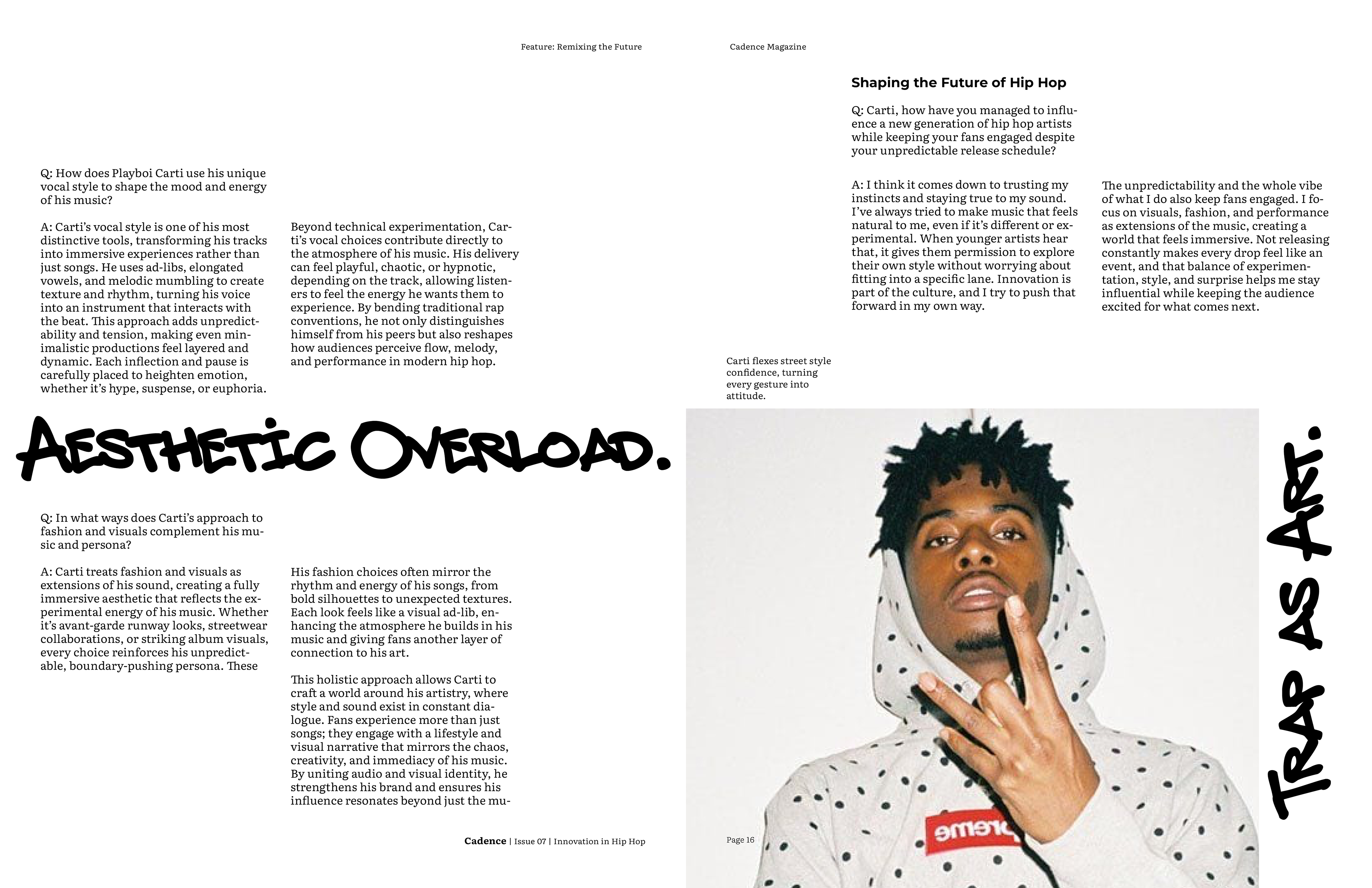
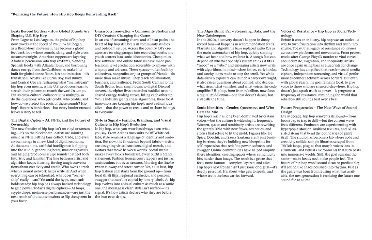
For the final magazine I decided to incorporate bold graffiti callouts, with the typeface choice inspired by the idea of ad-libs in hip hop. I used a 5 column grid system to replicate the open endedness in rap. The articles all start with a black and white image, however from there color may be incorporated, depending on what is necessary to convey the artist properly. I chose Literata as the typeface for body copy, since it is very legible, and Montserrat as a bold contrast for subheadings and decks.